'jamjam' is a lunch kit service that provides healthy and nutritious lunches for kids. Children who can’t take enough nutrient meals and parents who are too busy to can’t look after their kids’ diets can be provided plenty of healthy food by 'jamjam'. 'jamjam' is different from other meal kits brands because it is only for kids, so it provides diverse mandatory nutrients for kids’ health. Fresh meals will be delivered every week. 'jamjam' will provide well-constructed diets based on pediatricians and nutritionists.
Roles: UX researcher, UI designer, Product designer
Overview - Product
Most of the schools in Canada do not supply lunch to students. Some of the students skip lunchtime, don't/can't bring lunch boxes, or have junk food. The purpose of this project is that provide nutritious and healthy food to students in order to avoid getting diseases such as obesity, bone trouble and growing problem. This is the reason why I make the meal kit system for kids.

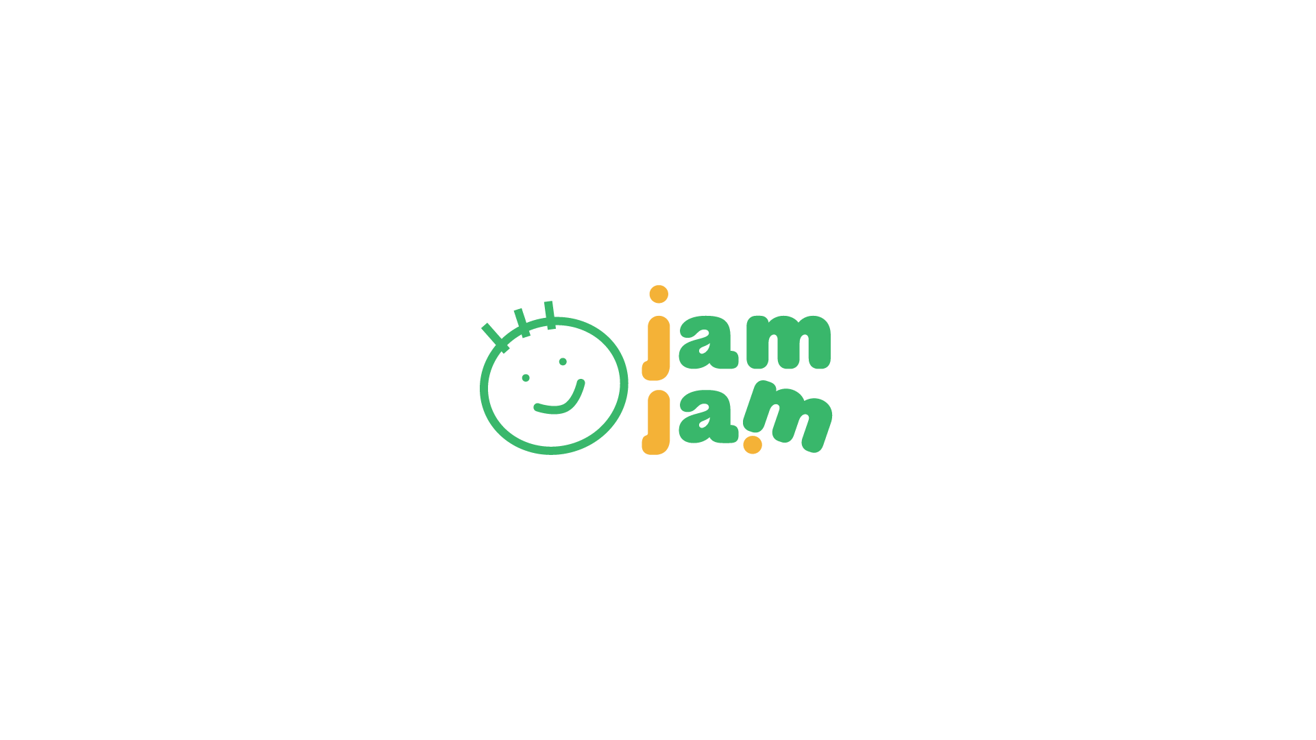
Sketch - Logo
This is a rough sketch. I wanted to design the 'jamjam' more friendly, and not too serious.
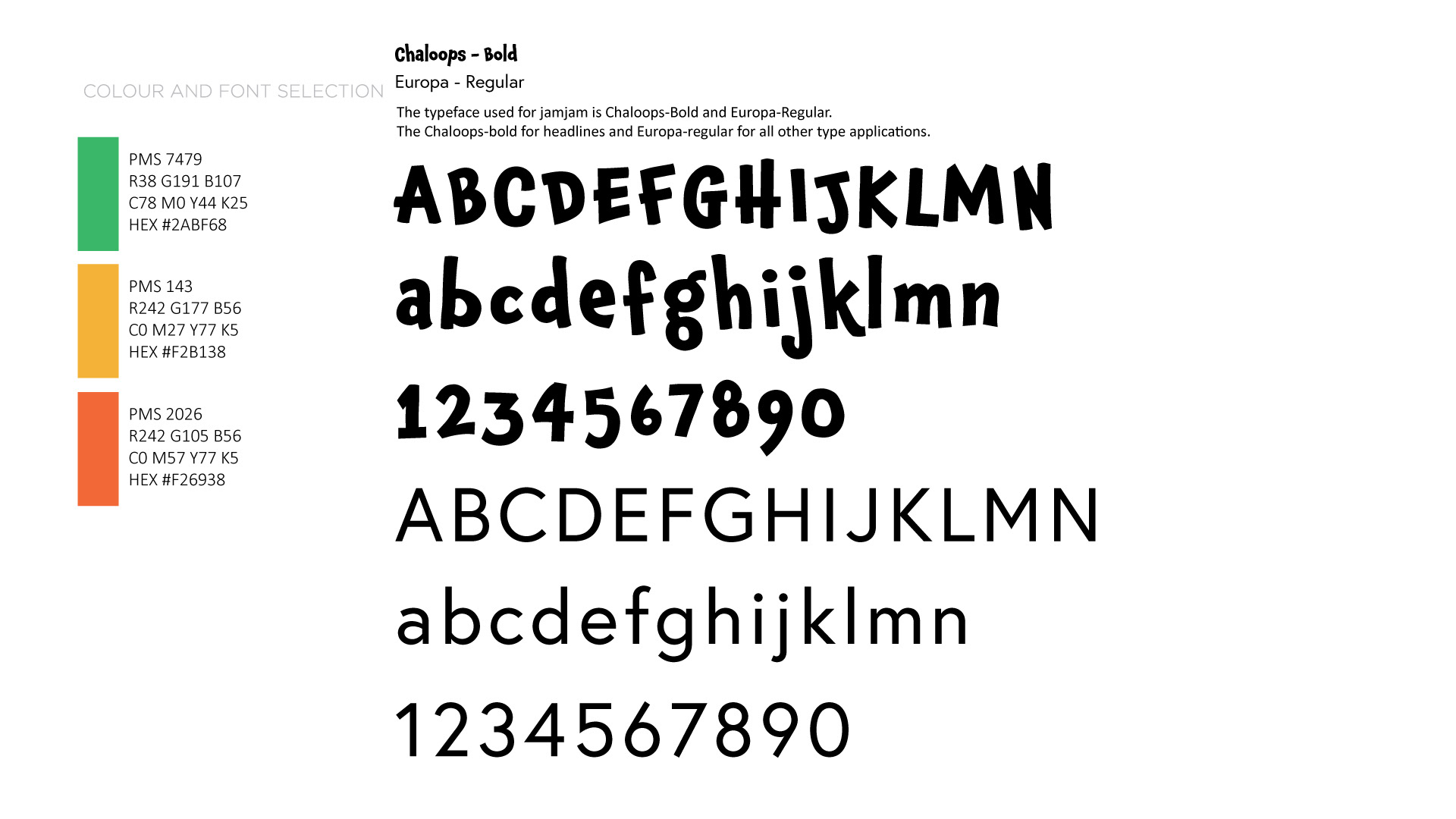
Colour and Fonts
The brand adjective is Active, Lively, and Energetic. I chose green and yellow as the main colours, and orange as the sub colour. The Chaloops font was used for the headline, and the Europa font was used for most texts.
Pitch Video
It is a 1-minute pitch video. It is made of Illustrator and After Effects.
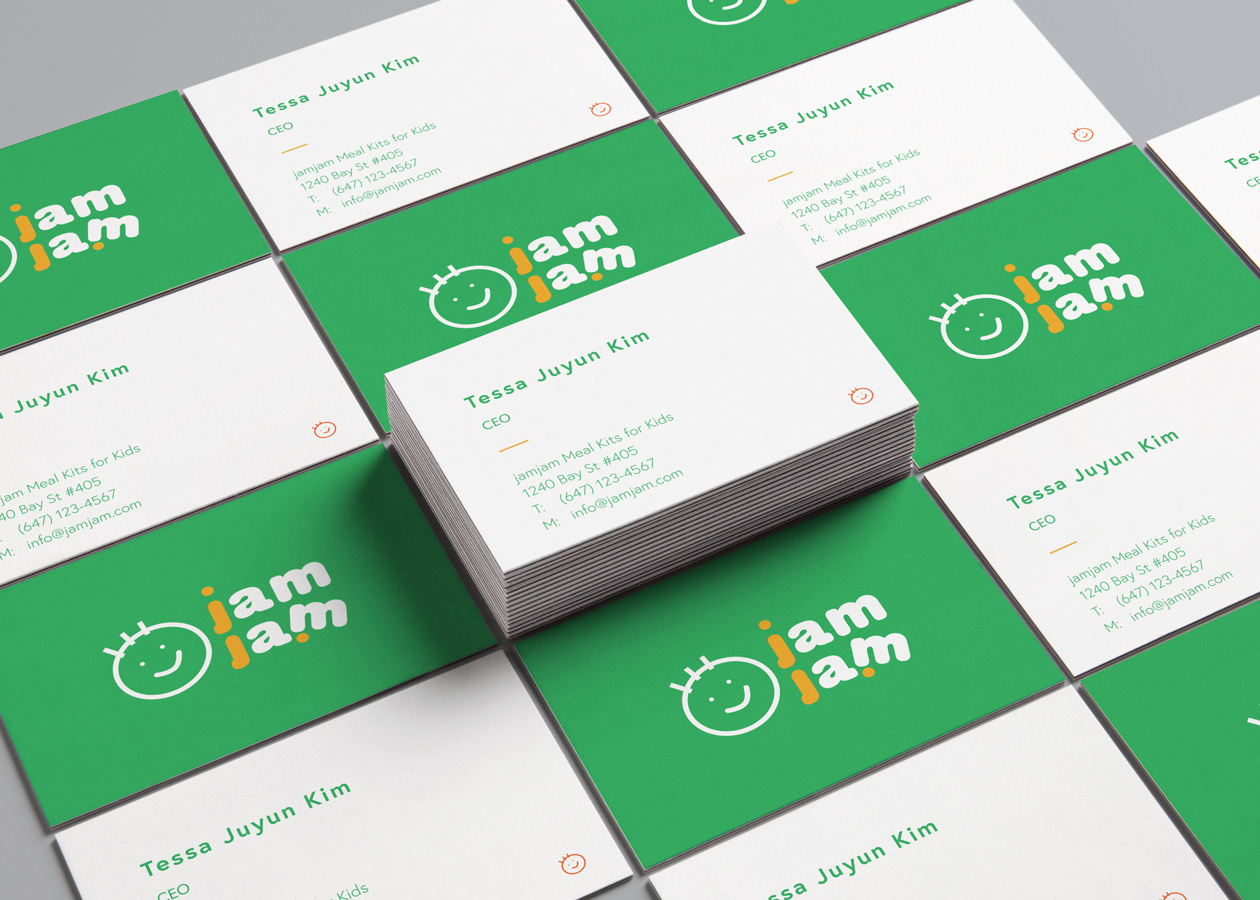
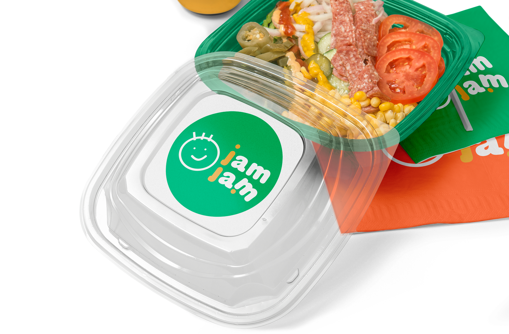
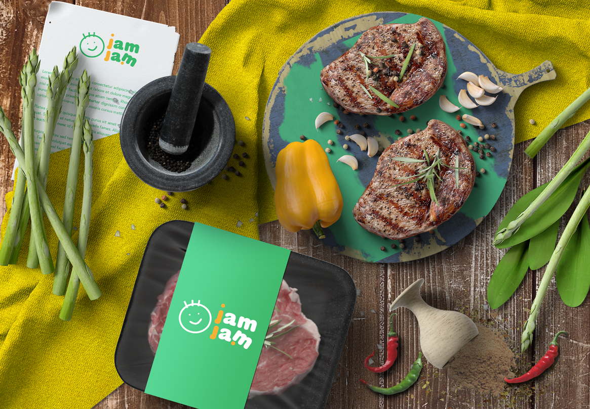
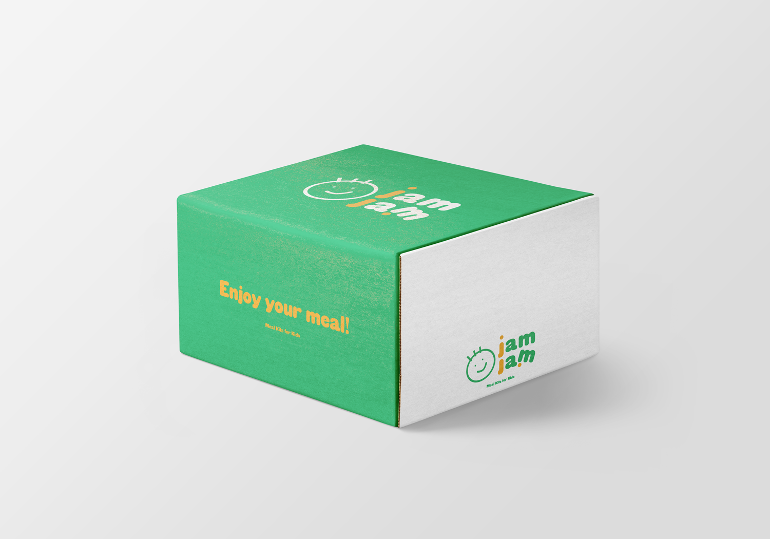
Mock-up - Product
These are the product mock-ups. It is a meal kit brand, so I made food container designs and a box design.
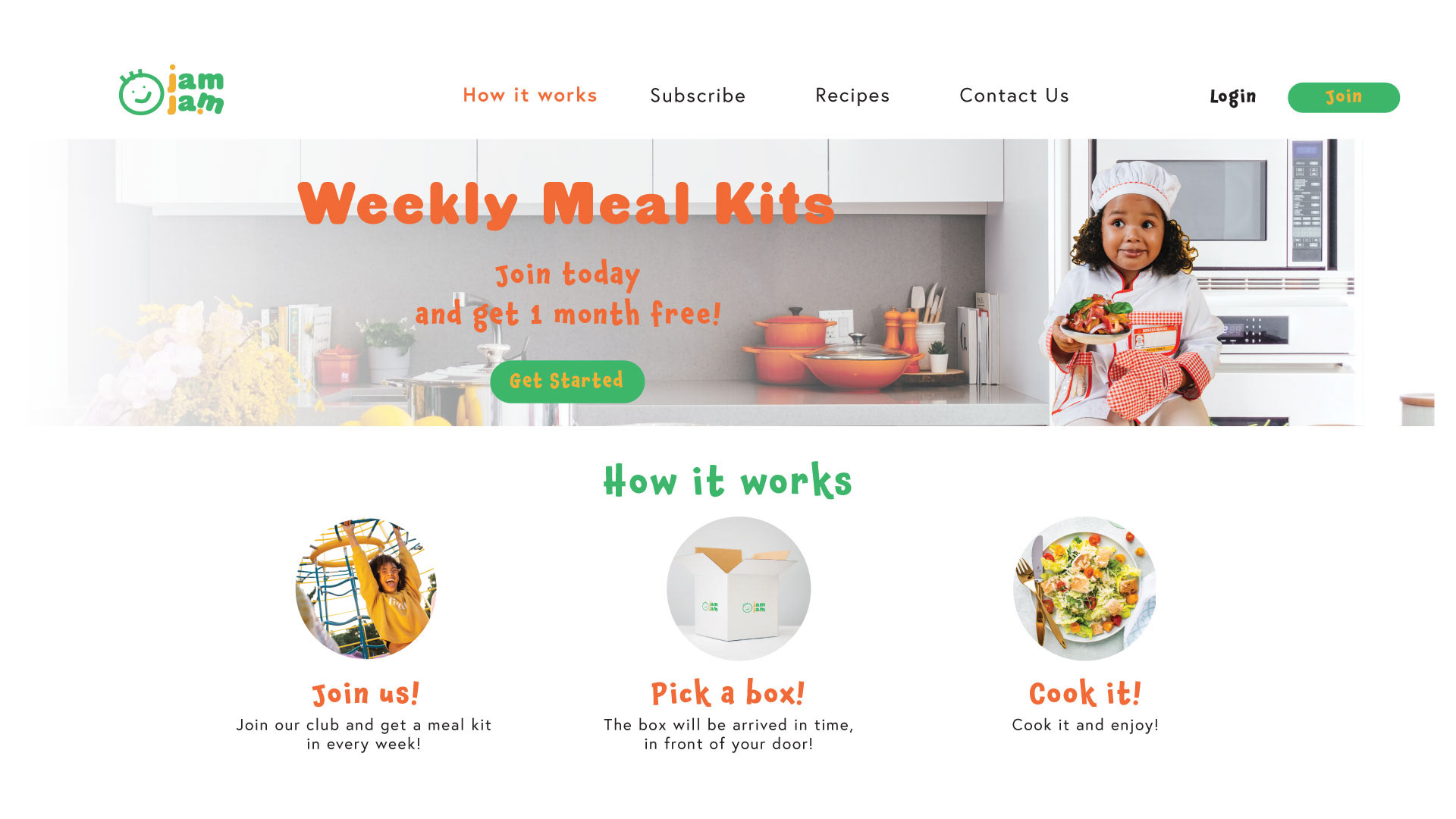
MOCK-UP - web
These are the website mock-ups. It introduces what this page is and promotion, and how it works.
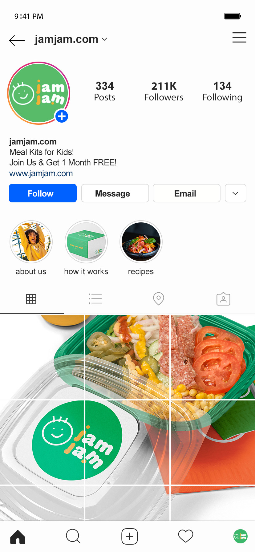
Mock-up - Social media
These are the social media mock up. It shows how the social media would be shown to users.
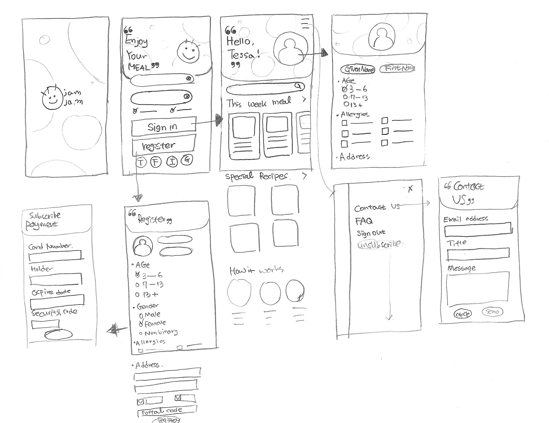
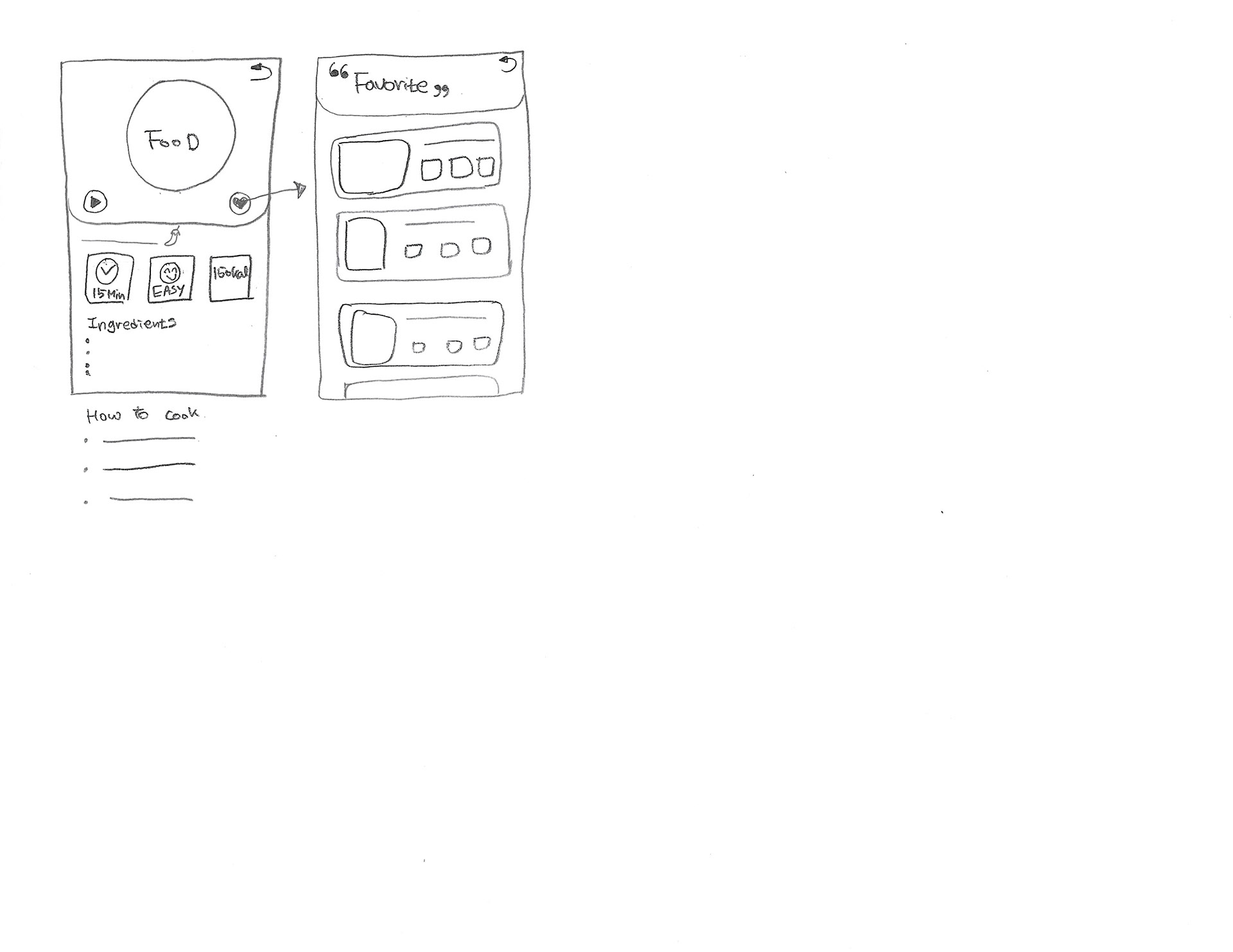
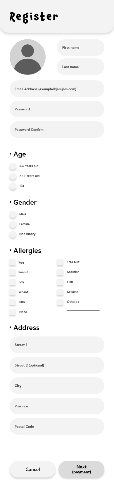
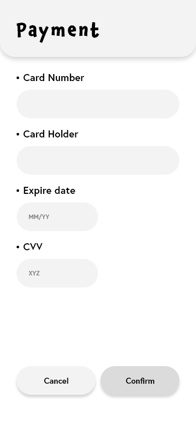
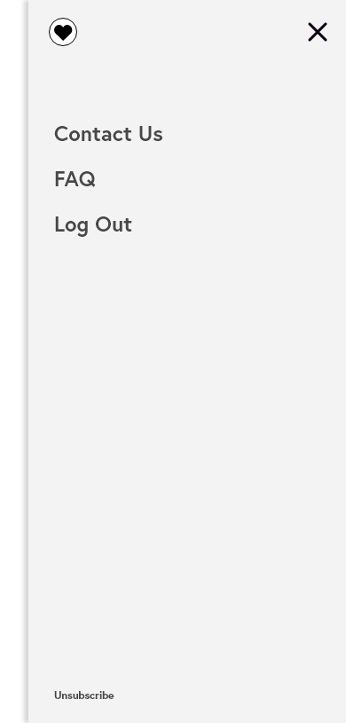
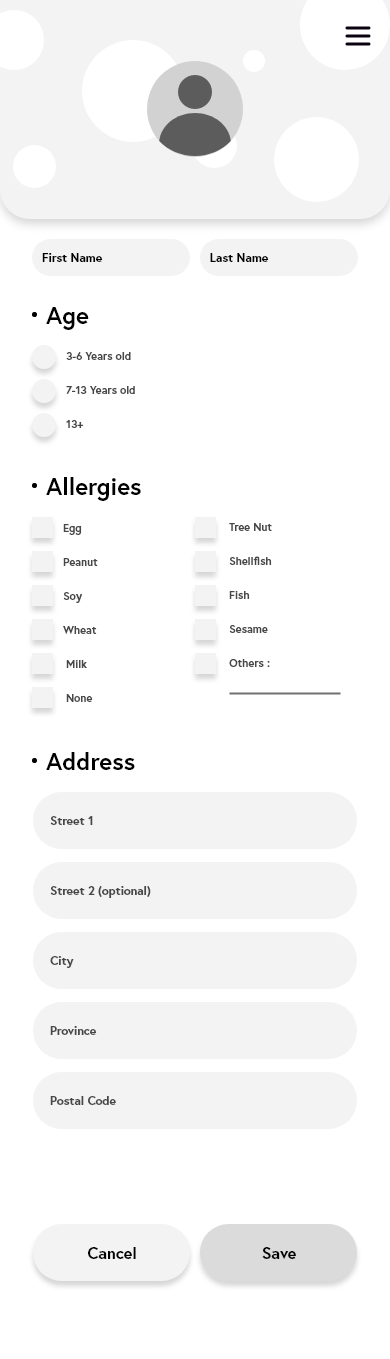
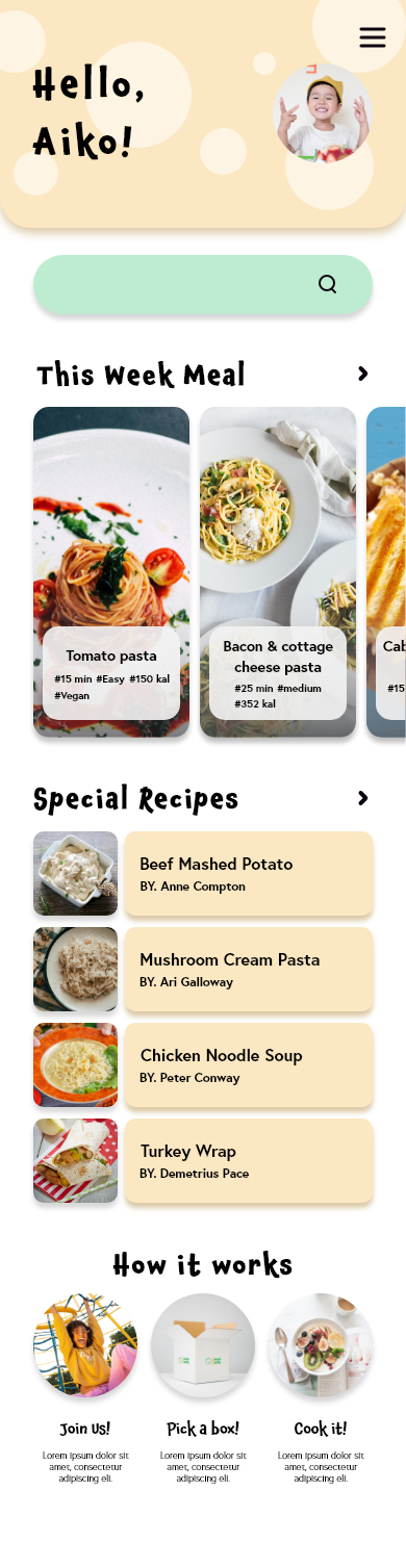
UX Design - Rough app sketch
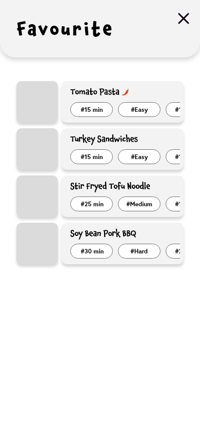
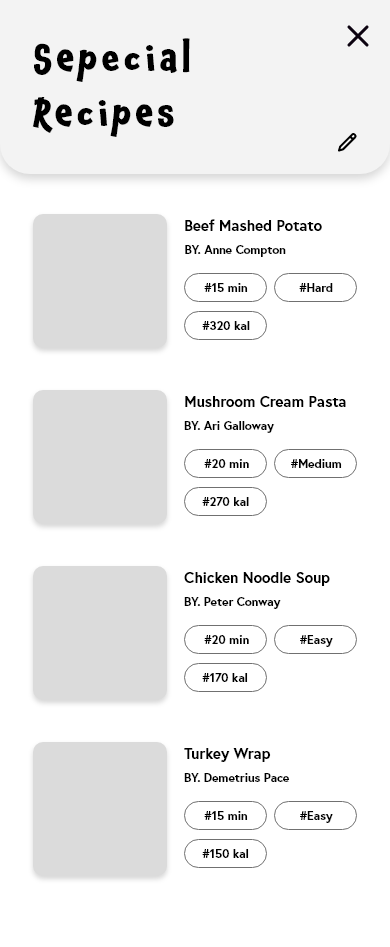
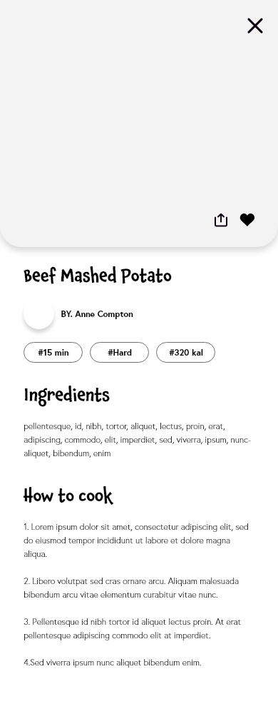
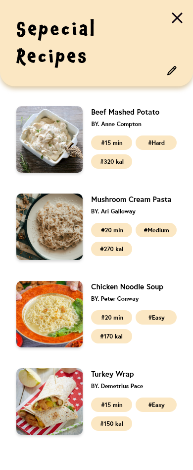
These are the rough app sketch. It is including functions that I want to provide to customers. The top occupies a big user section, and the main screen has all of the information to use. Each recipe shows the cooking time, difficulty, and calories.
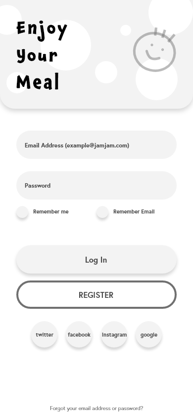
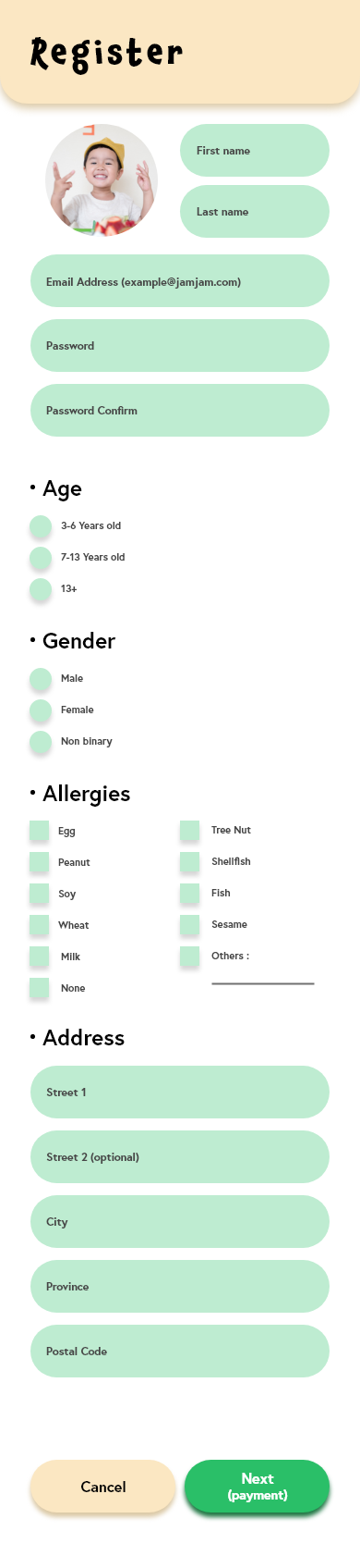
UX Design - Prototype (Grey)
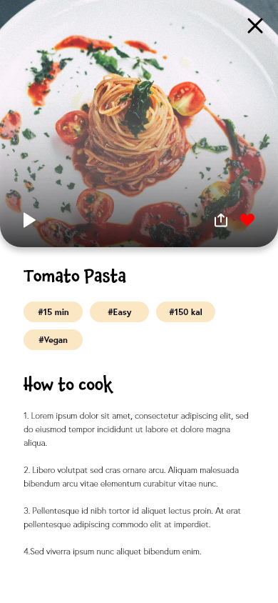
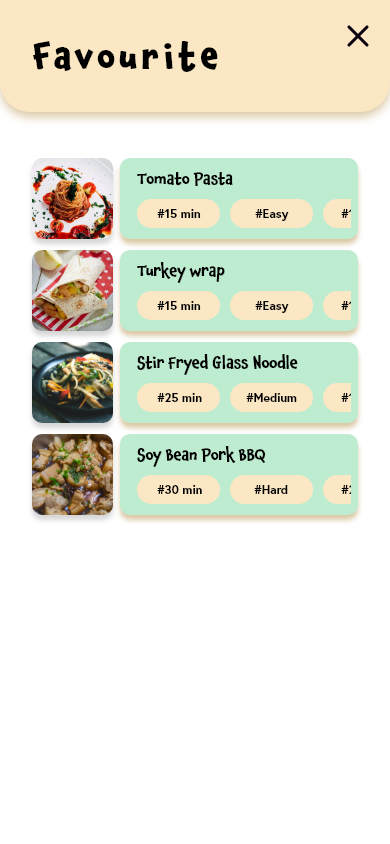
Some parts are slightly changed. I added hashtags to the recipes.
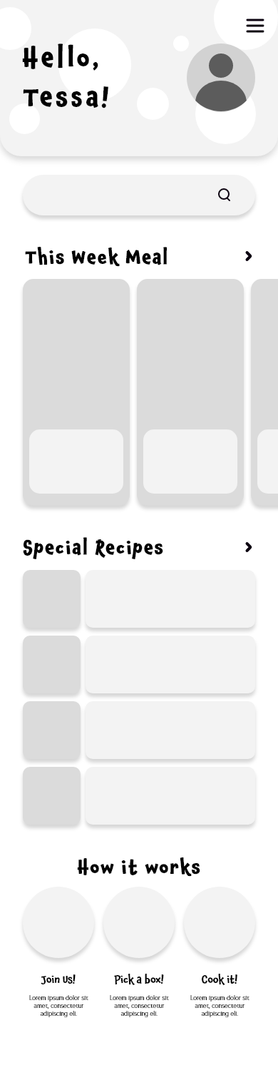
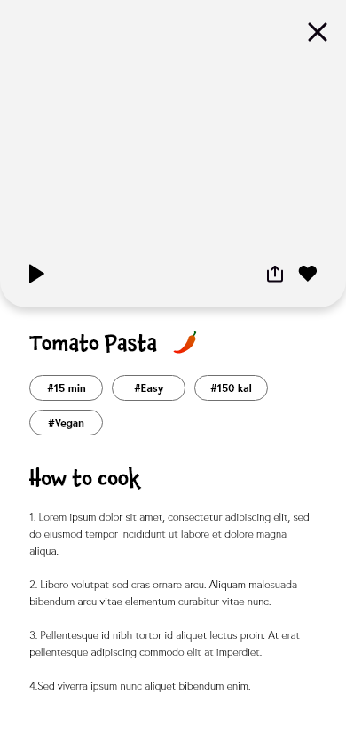
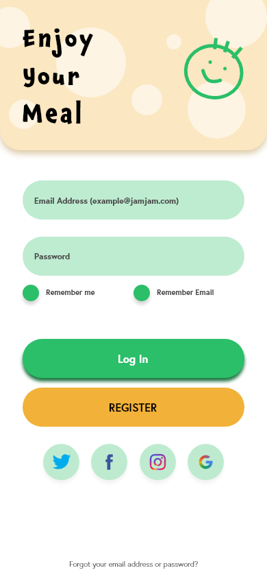
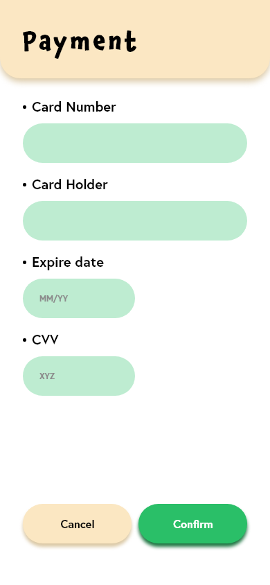
UX Design - Prototype (Colour)
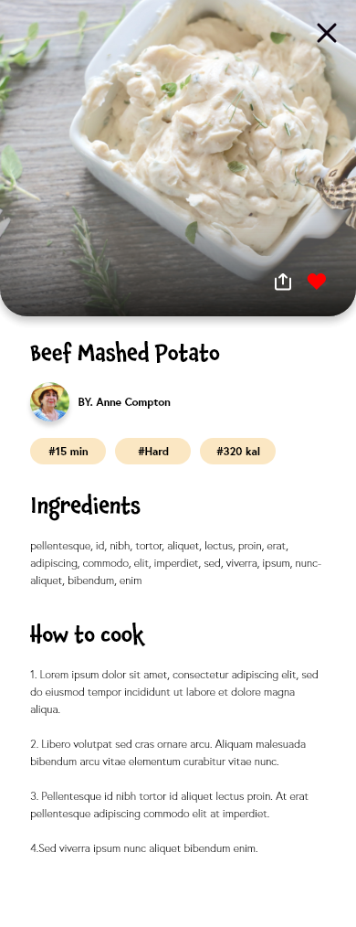
Instead of using vivid colours, I changed the opacity in order to reduce the tiredness of customers' eyes. Also, I added a gradient on the food images to be looked like deeper and added shadows on clickable assets in order to diversify the visual effects.
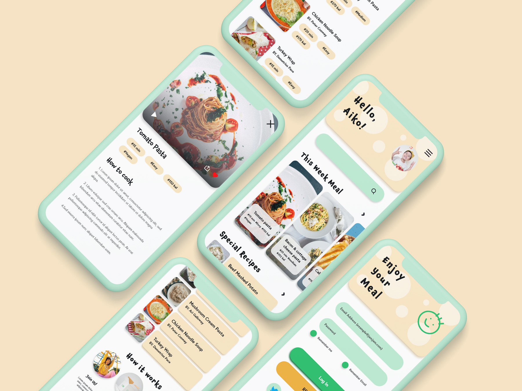
Mock-up
This is the mockup the customers will see.
Final thought
This work was pretty impressive for me. I created all of the assets, functions, shapes, texts and everything, and I had to edit again and again. In this process, I learned how it is difficult to design and create an app from the zero foundation. I researched Behance and they gave me a lot of impressions in the ux design part. Also, it would have been great to be working with friends because it was really hard to get feedback since I have been working alone.
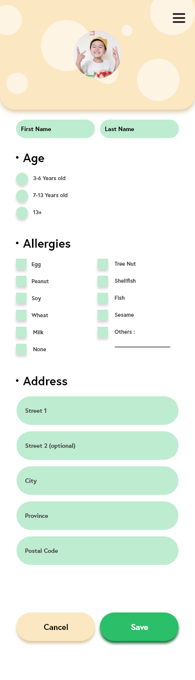
I wanted to add some colours on the background of the screen, but it looks weird whenever I add colours or some shapes, so I left them just white colour. Well, I feel really happy that I create this app!